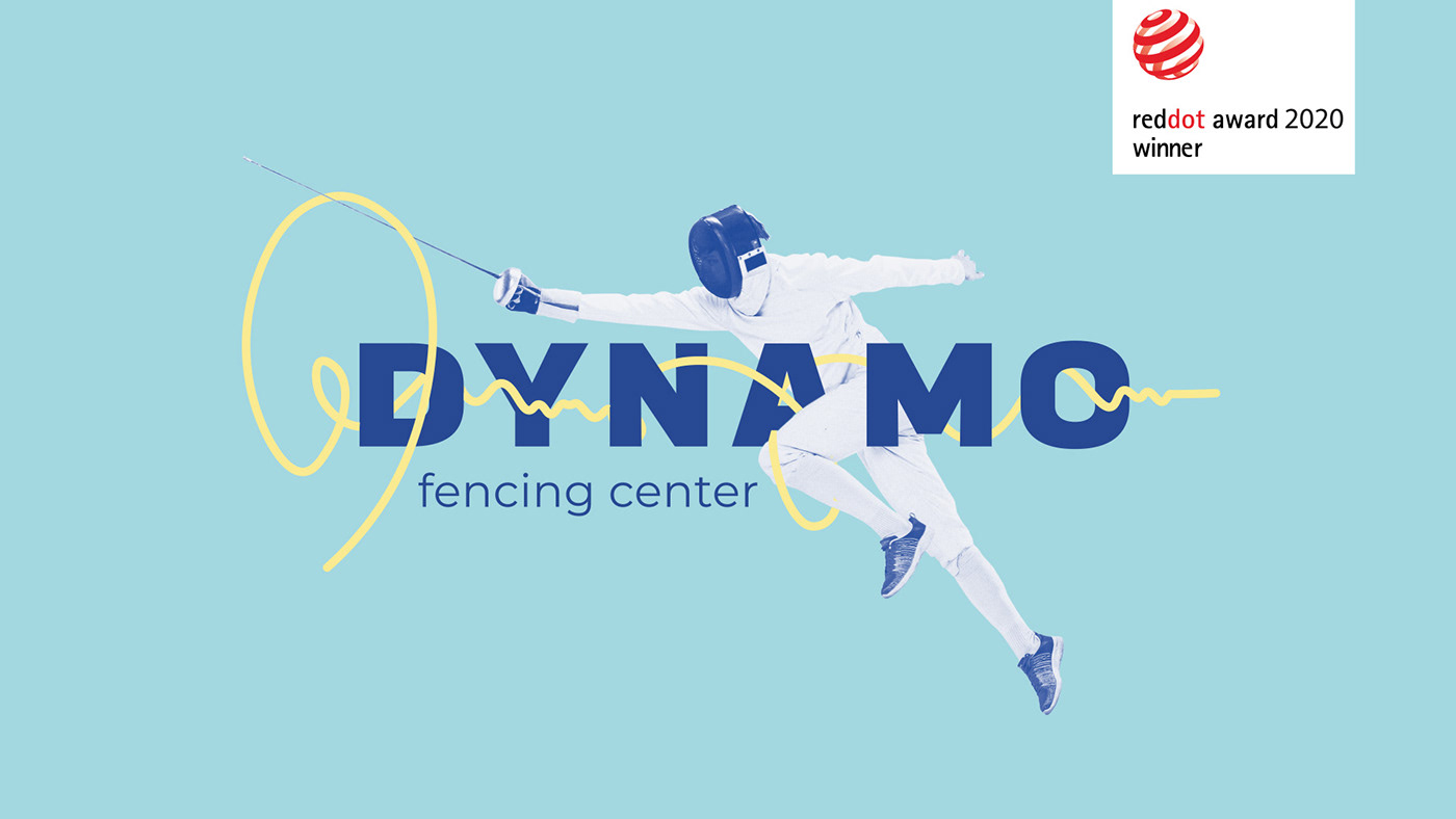
DYNAMO FENCING CENTER is a professional fencing club in Boston, USA. The school is really very successful and has already given birth more than one generation of world champions.
Dynamo. It's naming itself is widely used and does have really strong associations. Therefore, it was important to make brand-new associations which would work for the fencing center. It's about the aspiration for victory over an opponent and pleasure that one feels when within — that is the key stimulus in sport.
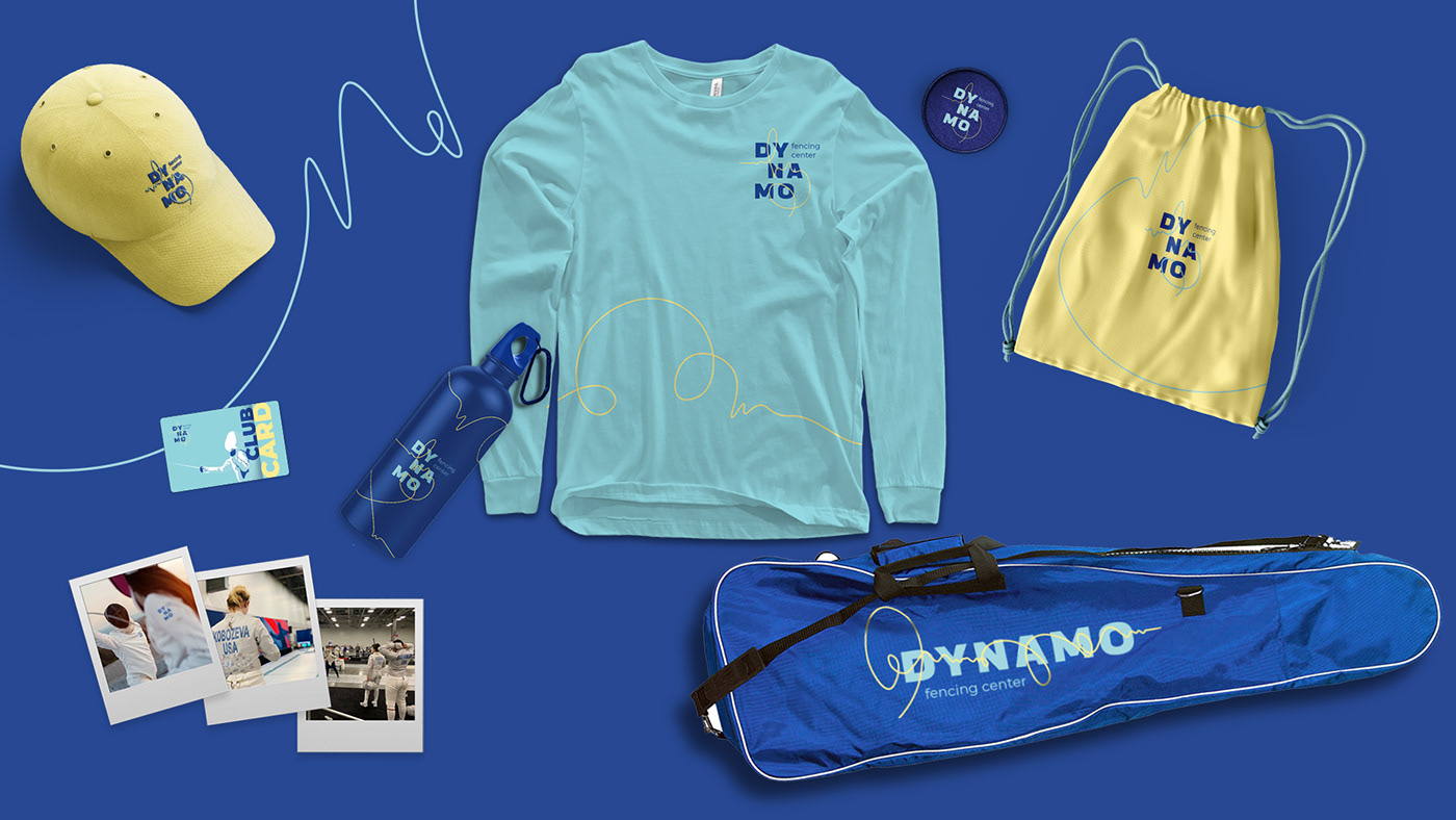
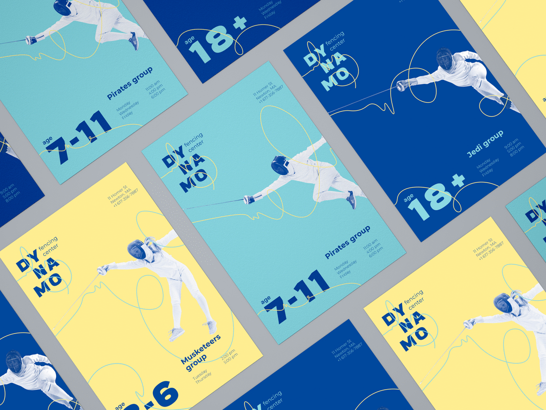
Creating the identity we firstivally were focused on the emotional message. The dark blue color is for the opponent’s shadow. The blue tint is for the musketeer's epanche. And the golden-lemon glow is for the saber tip. And the more we were developing this idea, the more we were making sure of the nativity of such a visual identity for fencing.
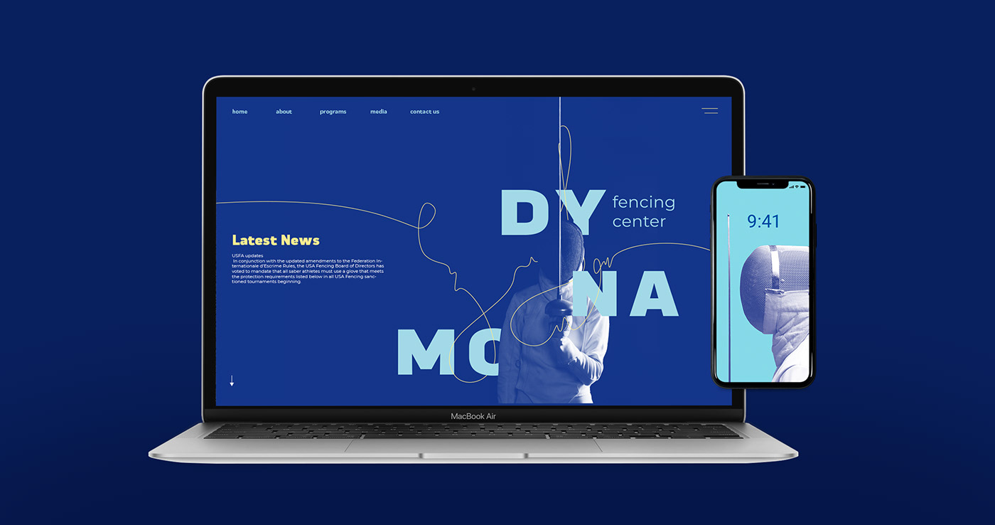
The idea of the logo itself is a visualization of the line — a way which of the saber tip goes when during attack.
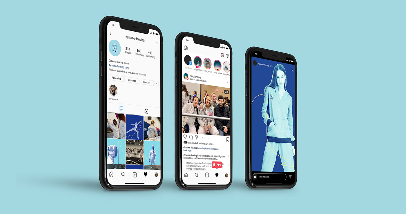
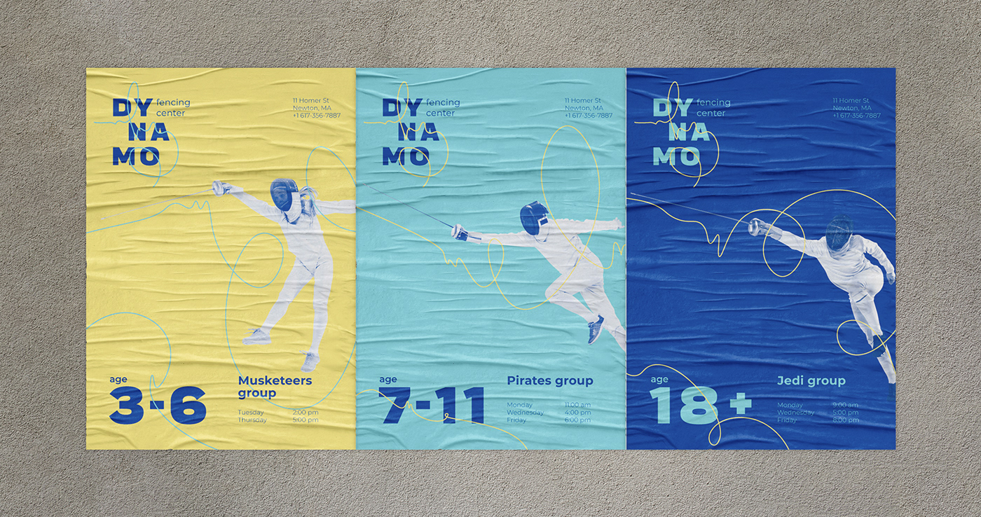
At the moment, DYNAMO FENCING CENTER is the only school with its own brand communicating it within its site, camp, school etc. And such a feature is a really strong competitive advantage.