Ricond has been well known for its sweets since the middle of the last century. The company is developing pretty well, so there arose that idea to create a new product — sweets with whole dried fruits and nuts.
For the product is kind of unusual for this market, it definitely needed an interesting design.
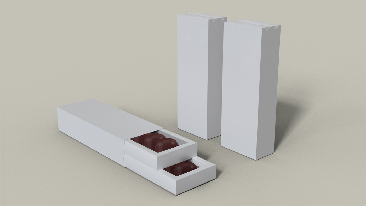
First we decided to develop the design of the package, for this is the first thing by which the product could stand out on the shelf. So our approach was quite non-standard — a two-tier form factor with pull-out shelves. So the package was like a gift itself rather than just candy and it looked really premium.
Moreover, the candies are fragile and it was important to protect it by designing a separate capsule for each candy. This would ensure accurate storage and preserve all the taste and appearance qualities of sweets.
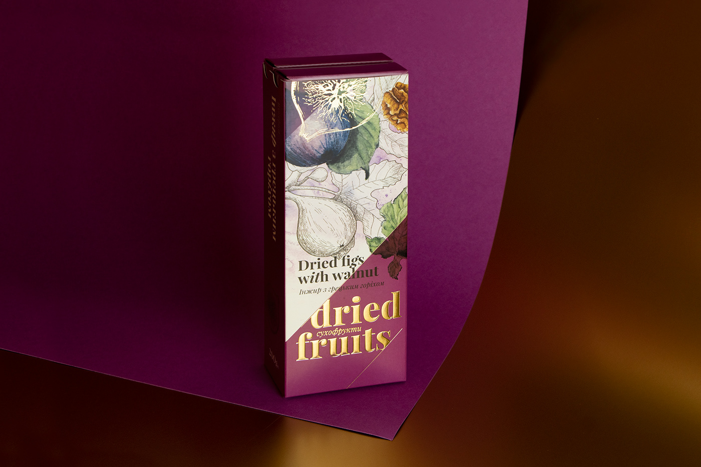
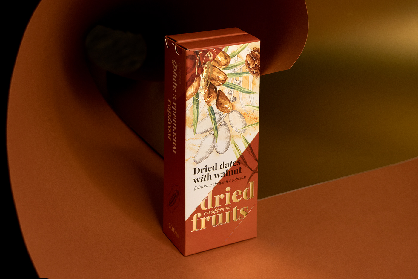
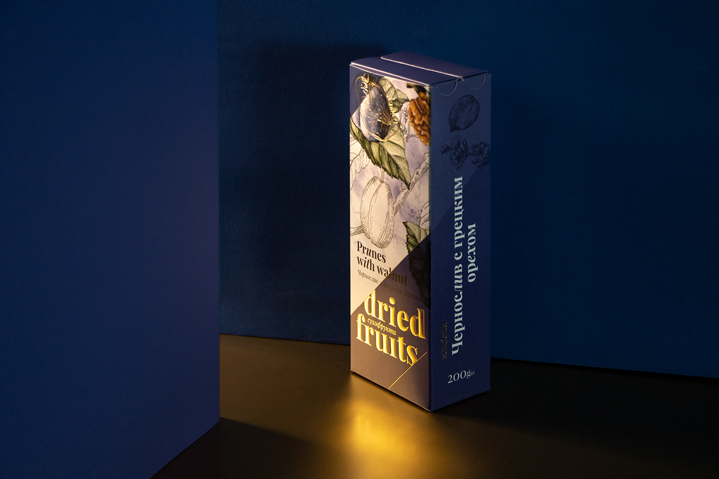
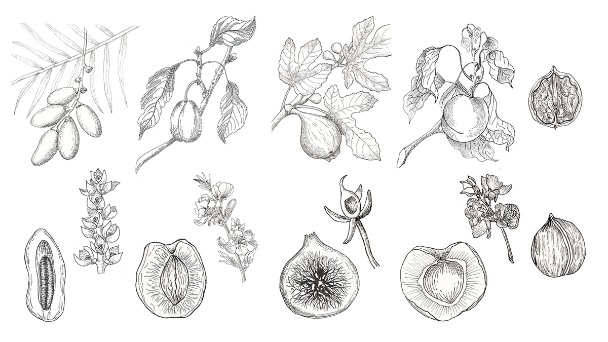
As we used craft in design, we compiled both watercolor and graphic illustrations. Strict liner lines are associated with the classic taste of dark chocolate, and the bright colors of the watercolor emphasized the usualness of dried fruit and nuts.
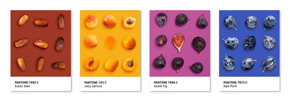
For preserving the perception of premium-class, there was used a relief stamping with gold foil and for clear identification, we created bright corners of different colors which assured the product was clearly visible on the shelf. Plus the number of colors allows perfect scaling for more tastes.
Moreover, the candies are fragile and it was important to protect it by designing a separate capsule for each candy. This would ensure accurate storage and preserve all the taste and appearance qualities of sweets.
As we used craft in design, we compiled both watercolor and graphic illustrations. Strict liner lines are associated with the classic taste of dark chocolate, and the bright colors of the watercolor emphasized the usualness of dried fruit and nuts.
For preserving the perception of premium-class, there was used a relief stamping with gold foil and for clear identification, we created bright corners of different colors which assured the product was clearly visible on the shelf. Plus the number of colors allows perfect scaling for more tastes.