
My goal for this exercise was to design a better job opportunity experience for passive users. I generally start by taking a look at the site in question. In this case, I paid extra attention to LinkedIn's “Jobs You May Be Interested In” section as well as some of the Jobs pages for various positions and companies.
It seemed the current sidebar section for suggesting jobs to passive users was going unnoticed and/or could be directing more people to apply for said jobs.
It seemed the current sidebar section for suggesting jobs to passive users was going unnoticed and/or could be directing more people to apply for said jobs.

With that I began my intial brainstorm and early-stage sketching, paying special attention to what types of things would pique a person’s interest about a particular job opportunity.

Pen & Paper are my bread & butter when it comes to early stage ideation.


From this I was able to select a list of features/items thatwould be useful to a passive user, while keeping in mind what info was available though LinkedIn.
This meant taking a closer look at several existing jobs pages to see what information was available. Doing so helped rule out specific features (such as Avg. Salary and Employee Satisfaction Rating) which might not be provided by some companies. While I toyed with the idea of introducing third party content to fill for this (e.g. Glassdoor for Company Reviews, etc.), I ultimately decided to keep everything in-house.

After sketching a few more wireframes, I began to create several flexible templates that could be used to direct users to the new job opportunity page. The focus for these “Job Leads” was to highlight key aspects of the job and its parent company, while, maintaining a clean visual design that pulls relevant content from said company’s LinkedIn page.

This content box (along with the next few below here) were designed to appear in the main feed when a user logs into LinkedIn. The goal here was to capture the users attention through visuals and vaulable details in order to drive the user to the job page.

The multi info content boxes are designed to allow users to switch out the bottom section of the box in order to view not one, but two interesting facets of that particular job opportunity.
In this example, the user would see a section entitled “Multiple Connections” which would reveal common connections between the user and the job at hand.
By clicking the grey square icon on the left, the content is replaced with the first few lines from the Job Description.
Of course, the bottom section can be replaced with any other job highlights--you can see some of the ones I was thinking of in the initial brainstorm if you scroll back up.
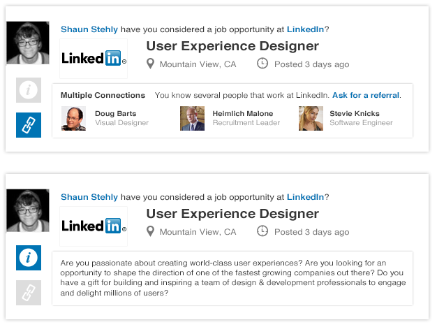
I also considered having the Multi-Info content boxes have three different Highlights. In the end, I figured that three highlights would be too busy and would detract the user from the main goal which is to direct them to the Job Opportunity Page (and ultimately to apply).
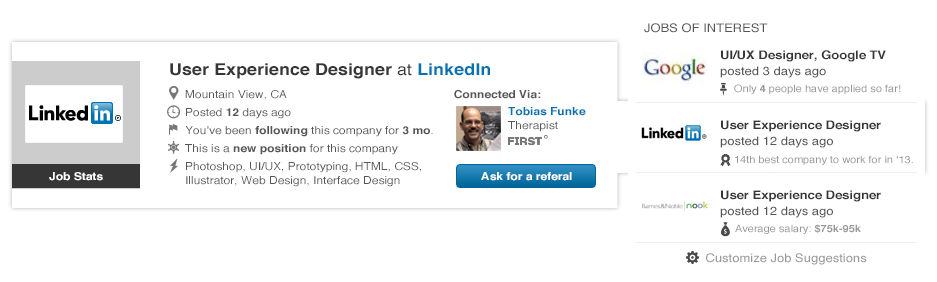
Afterwards, I whipped up an alternative to the “Jobs You May Be Interested In” section that currently appears in LinkedIn’s side panel. I wanted to provide more interesting content to highlight that these jobs were not being recommended lightly. They are tailored to the user in some way or another and this is where they can quickly find out why there’s a match. If they like what they see they can continue to the jobs page to learn more.

The two popout sections found above and below this text each highlight different aspects of the position and the company. Above we see a number of details about the job as well as text pulled from the job page and urging the user to read more by following the link. Below you have similar content that is formatted a bit differently. The bottom popout also features a section indicating how you can benefit from your current connections to the company.
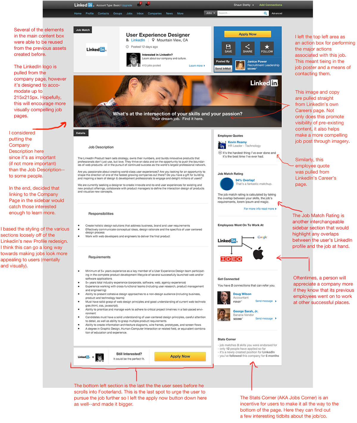
At this point, I went back to the existing Jobs Page by taking a closer look at a job opportunity for a User
Experience Designer at LinkedIn. I knew that for the redesign I wanted to keep most of the essential content, while cleaning up the clutter by embracing white space and clearing out the info that doesn’t push a user to apply for the job.
Experience Designer at LinkedIn. I knew that for the redesign I wanted to keep most of the essential content, while cleaning up the clutter by embracing white space and clearing out the info that doesn’t push a user to apply for the job.

This brings us to the final step--the newly designed job opportunity page. Think of it as a regular job page on steroids. It’s tailored to the user in more ways than just matching the job title to one of your previous positions.

Let’s go into a bit more detail.
If you’ve made it this far, I’d like to thank you. I know how easy it is to miss all the stuff that lies below the fold. Anyway, I hope you've enjoyed my attempt to improve LinkedIn's interface and if you have any questions, please, don’t hesitate to get in touch.


