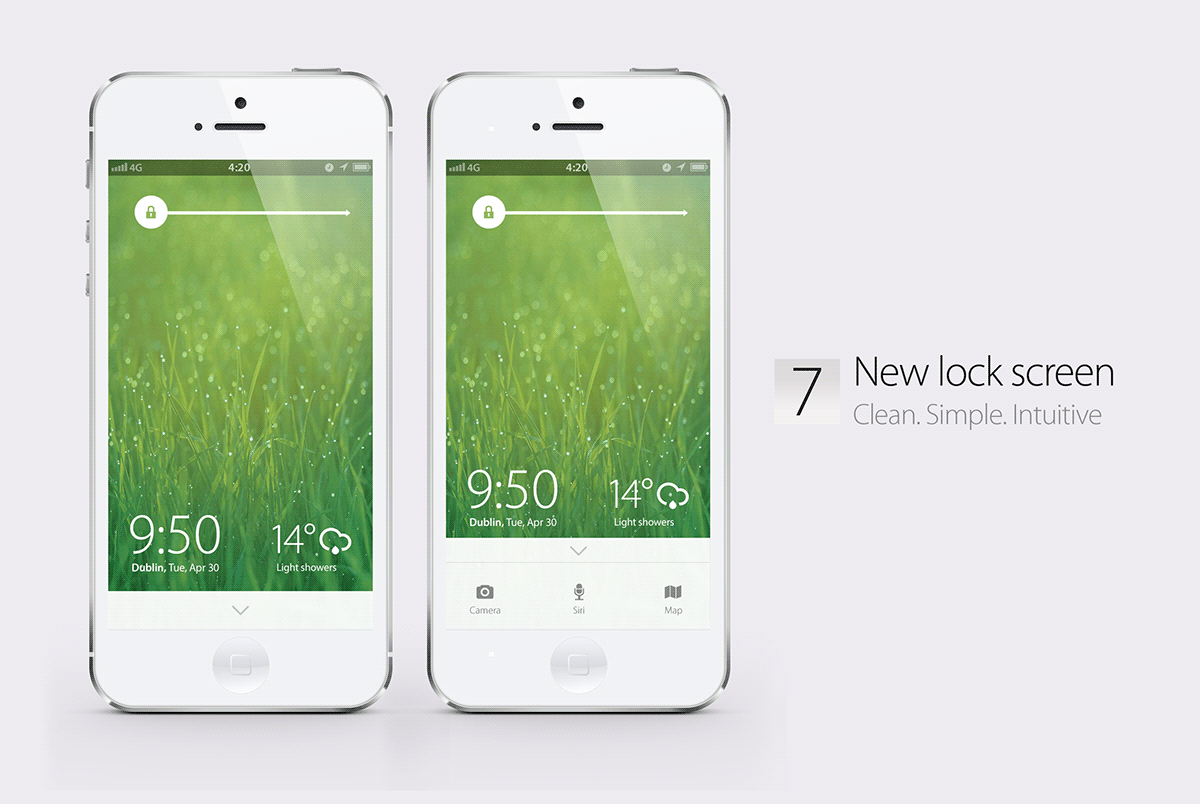
The idea was to keeping the UX as familiar as possible to the millions of users while really trying to simplify the aesthetic.
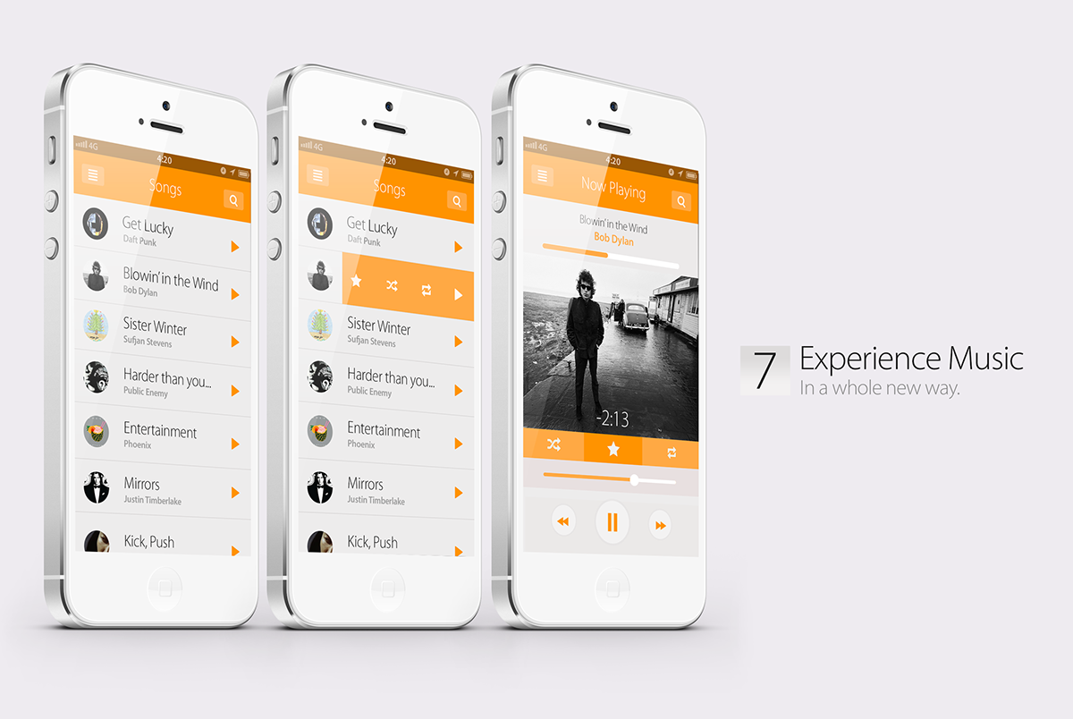
I wanted a lot more whitespace and bigger typography in the Music app. Also, I liked the idea of hiding the UI until really needed - an idea noted from apps such as Mailbox for iOS.

Widget Centre was fun because it was great to try a completely new idea for the iPhone.

I really wanted to strip down the glossy icons we all know from iOS, while still making them recognisable.