


Originally published on Nov 18, 2018 on Medium.com.
I know I know, again? Hasn’t this been done already? Frankly, yes. You can read that article, by REASSEMBLE, here. We think it is a good redesign, however, there are many things we felt could still be improved on.
It has already been proven that the current SMRT in-train screen system is ineffectual, if not through hearing friends and family complain about it, then through REASSEMBLE’s analysis of it. Here’s what they found:
- Commuters just want to know where they are, and how far they are from their destination
- There are many irrelevant screen rotations, especially the landmark photos
- The typeface of choice is hard to read
- Animations are draggy and subtract from information dissemination
- Station layout map is too complicated and does not provide needed information fast enough
Other than these, we found some other issues ourselves through surveys and user testing:
- The current design is unappealing
- Full train network not shown, printed maps along carriage sometimes not even provided
- Inefficient use of the dual screen system
Design Considerations
Features
We want to design something that incorporates:
- A larger portion of the network map
- Clear visuals for where the train currently is and the direction of travel
- Snappy and helpful animations that add to information dissemination rather than take away from it
- Simple, easy to understand layout
- User experience guidelines so commuters have a good experience using the screen to retrieve information
- Ad space, SMRT might require this especially if we are reorganising all the information on the screens (we tried calling and emailing them for design requirements, no replies all round, are we surprised)
Typography
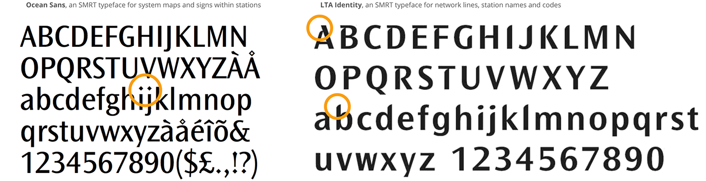
SMRT has their own sets of corporate typefaces for print use, under the Ocean Sans font family, and a specific typeface for network lines, station names, and codes, called LTA Identity. However, they do not have a standardised typeface for digital use, which has vastly different typographic requirements to typefaces for print use.
Some features of typefaces that are not ideal for quick legibility are:

- Lowercase “g” with loop descender
- Bowls and other gaps for lowercase letters that are too small especially with increased weight (the loopy “g”, “a”)
- Inconsistent spaces between letters (kerning)

- Inconsistent height between capital letters and numbers
- Various other features that might make a font less immediately legible (eg. “1” with “feet” as in Source Sans Variable, lowercase “j” that doesn’t hook at the bottom)

Based on these considerations, we have chosen the font family Roboto for our redesign. Additionally, it was designed for legibility and with digital screens in mind, and takes up less horizontal space than the other font families in consideration.
Type Hierarchy
Now to tackle the issue of type hierarchy. When we glance at something with type on it, our eyes are naturally drawn to the biggest or boldest text on it, so the most important information should be the largest and most recognisable.

Here is a side-by-side of the original design and our redesign.
Colours
The SMRT Corporate colour was created to maintain good contrast with all the colours of the current train lines, so that is the main colour we are choosing to use for our design. We are also using all the default train line colours, except for the North-East Line, which we changed slightly to better match the rest.

Our Final Design
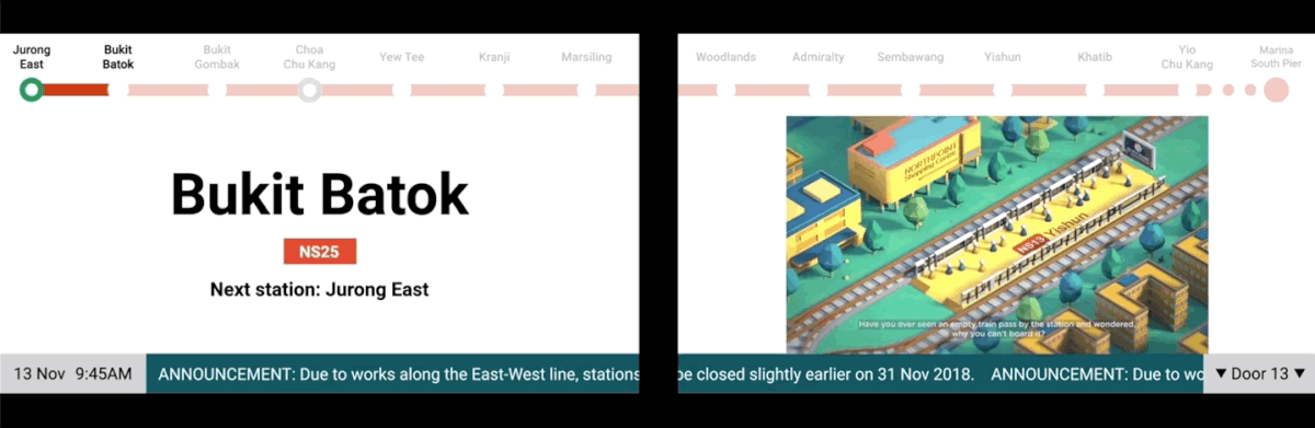
Train stopped at station

Doors Closing

Simple, quick animations

Notification pop-up
Bukit Batok to Jurong East
City Hall to Dhoby Ghaut
Mock up: how our design looks in a real train


