A "fintech" company approached us to develop a new brand and product. The initial brand had not established the traction the company wanted. The company was developing a new service and required a mobile app as well and thought it would be necessary to rebrand.
We started with a Brand Discovery where we asked the pertinent questions around the brand values, the industry and the audience. We then presented the Brand Audit based on the current existing brand. We developed a Brand Strategy that looked was grounded on the company's core values and what problem the company was hoping to solve for the customer. Once we established the target audience and analysed the competition, we were clear on what the brand to deliver.
We began on visual identity work with research of brand metaphors representing the company attributes.

Naming
One aspect of the corporate vision was:
The area of focus is Africa, Middle East and Southern Asia
This framed our conceptual area and we looked for inspiration of something that would be recognisable in this geographic area. After some serious research on something that would tick most of the boxes that the client revealed, we settled on the Honeyguide.

A Greater Honeyguide. Photo: Nigel J. Dennis/Gallo Images/Corbis
The Honeyguide shows people where to find wild bee hives. The people take the honey and leave the wax combs that the birds enjoy. The bird can guide the gatherers for distances of over a kilometre to the bee colonies. Unlike other birds or mammals, honeyguides are not domesticated, trained or coerced. This mutually beneficial relationship probably goes back to the earliest days of human existence in Africa.
The Honeyguide family of birds exist only in the Southern Hemisphere with most species in Africa and only two in Asia.
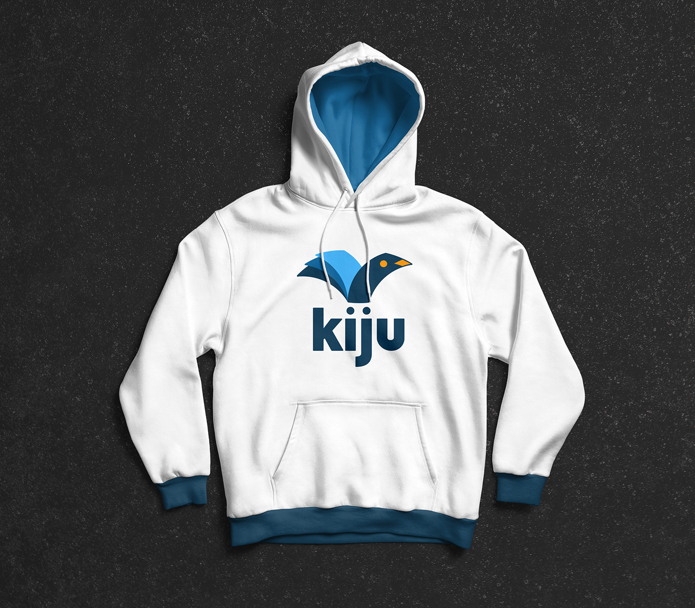
The Kiswahili name for the honeyguide is Kijumbe. We shortened the name to Kiju. While Kiju does not mean anything in particular in East Africa, we had the opportunity to define the brand name the same way Google redefined a 'googol'.
The other metaphor used is the Wallet.

This is the first sketch of the 3 designs for the client was to select from.

We used the Golden Ratio and this technique helps to build balanced, aesthetic shapes. For this logo, it was extremely helpful.

Once we tidied up the logo mark, we added the logo type. And this is how it looked finally.