


My Essentials is Delhaize America's value brand, which was launched in early 2011. This project was a great combination of across-the-board brand design from scratch and creative direction for the brand's implementation, which encompasses several hundred items. I really loved this project - I got to design the logo, packaging layout, typography, and develop the photographic style of the brand. I provided creative direction for a gang of freelancers as we pushed this design out across hundreds of items with multiple packaging styles and printing processes. The only initial boundaries of the project were to follow the lead of European supermarket chains which were using predominantly white designs at the time for this type of brand.

This was a redesign of the existing Healthy Accents logo. Healthy Accents is the Health and Beauty Care brand for all of Delhaize America. The identity development process took many months and several rounds of in-depth consumer research. I co-designed the logo and brand visual structure with Todd Wentworth, and then I was the creative director for the team of designers who applied the design across the several hundred items in the brand. This design was very well received by focus groups - my favorite comment was from one woman who said that she would be proud to have it out in her home for guests to see, as opposed to hiding it, as she did with many other private label products.

This logo is for an international, corporate-wide associate recipe contest for Delhaize Group, the Belgian parent company of Hannaford and Delhaize America. With the help of DG partners, I got to translate the logo and accompanying marketing collateral into several different languages, which was a wonderful challenge, given that the different alphabets and translated words didn't all occupy a consistent amount of space. Exactly my kind of project.
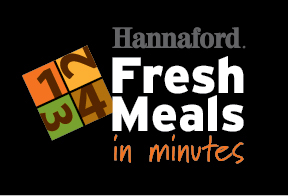
Fresh Meals in Minutes is a modular meal system comprised of multiple ingredients in four categories: Protein, Starch, Vegetables, and Sauce. The meals can be prepared in under ten minutes in one pan. The challenge of the design was to convey the notion of choosing four different elements and cooking the ingredients in a specified order. This logo won a Progressive Grocer's Store Brands "Best of the Bunch" Store Brand Packaging Award in 2012.

Every year, Hannaford typically runs a vendor-sponsored comarketing event which runs during the Final Four tournament. The flaming basketball was a stock vector image. As much as I love doing vector illustration, I will use stock imagery when it's appropriate and when it will save my clients time and money.

This logo is the centerpiece of an international Store Manager of the Year award program developed by Delhaize Group. The logo incorporates the official typefaces and colors of the Group, and is in wide use on all of the promotional materials, including a digital newsletter that I developed which ties the stories of the nominees in with the visions and values of the Group.


