


HRONOMY
Taking on the task of distilling HRonomy's essence in the HR realm, we launched a concise branding initiative.
The aspiration was not merely to visually portray their pioneering spirit in HR solutions but to ensure that the brand's ethos is palpably felt throughout every design nuance. This meticulous journey required an immersive exploration into the very soul of HRonomy, sculpting a brand persona that authentically mirrors its essence.
Recognizing HRonomy’s zeal for lucidity, evolution, and pioneering change, our design direction embraced a pristine and minimalist ethos.
This design essence not only aligns harmoniously with HRonomy's candid yet impactful role in the HR realm but also ensures an aesthetic that remains both classic and contemporarily relevant, striking a balance in an ever-evolving industry landscape.

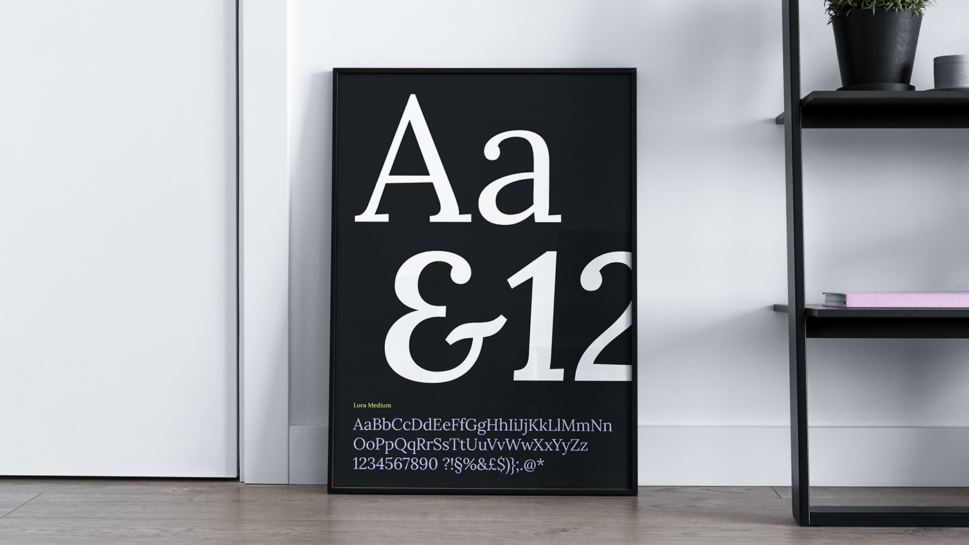
With its sophisticated flair, Lora seamlessly epitomizes HRonomy's seasoned expertise and professional gravitas.
Complementing this, the secondary font, Inter, provides an optimal reading experience, interweaving modernity into the design narrative. Together, they orchestrate a typographical symphony, resonating with HRonomy’s dual spirit of heritage and innovation.

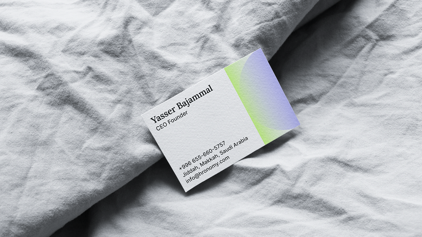
A vibrant interplay of light, luminous green-yellow and blue-violet tones—serves as a visual metaphor for growth, transformation, and forward momentum.
Anchoring these shades, the classic black and white duo introduces depth and timeless elegance, curating a multilayered narrative that's reflective of HRonomy's multifaceted mission.
The deliberate selection and juxtaposition of these colors not only foster an immediate visual intrigue but also ensure that HRonomy stands out distinctively, embodying both dynamism and sophistication in the vast HR landscape.
The deliberate selection and juxtaposition of these colors not only foster an immediate visual intrigue but also ensure that HRonomy stands out distinctively, embodying both dynamism and sophistication in the vast HR landscape.

The culmination of our efforts is a design identity that's a true reflection of HRonomy's ambition and ethos.
By adopting a streamlined, clutter-free aesthetic, we've facilitated an immediate, profound connection between the brand and its audience. The harmonized use of typography and colors crafts a brand experience that is as evocative as it is efficient, echoing HRonomy's unwavering commitment to fostering thriving work environments and pioneering change.


Client: HRonomy
Location: Jeddah, SA
Location: Jeddah, SA
Project: Brand strategy, visual & verbal identity.
Executive Art Direction: Jawad Zelmadi
Executive Art Direction: Jawad Zelmadi
Studio: Twenty Eight
Let's work together - info@cantonestudio.com


