Champion Tool Storage
In late 2020 the leadership of Champion Tool Storage approached Wild Giant about evolving their brand. The company was moving away from its decades-long partnership with Snap-On and moving into its own direct to market model. The owner described the company as a “Fifteen year-old startup”.
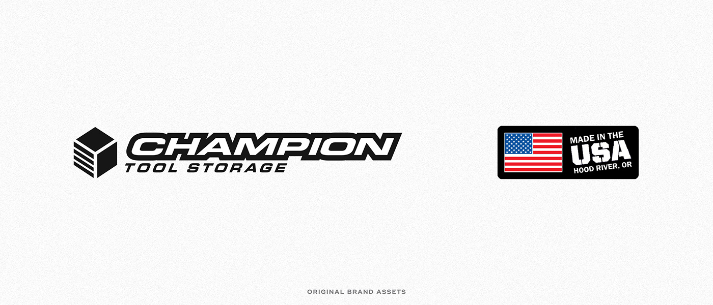
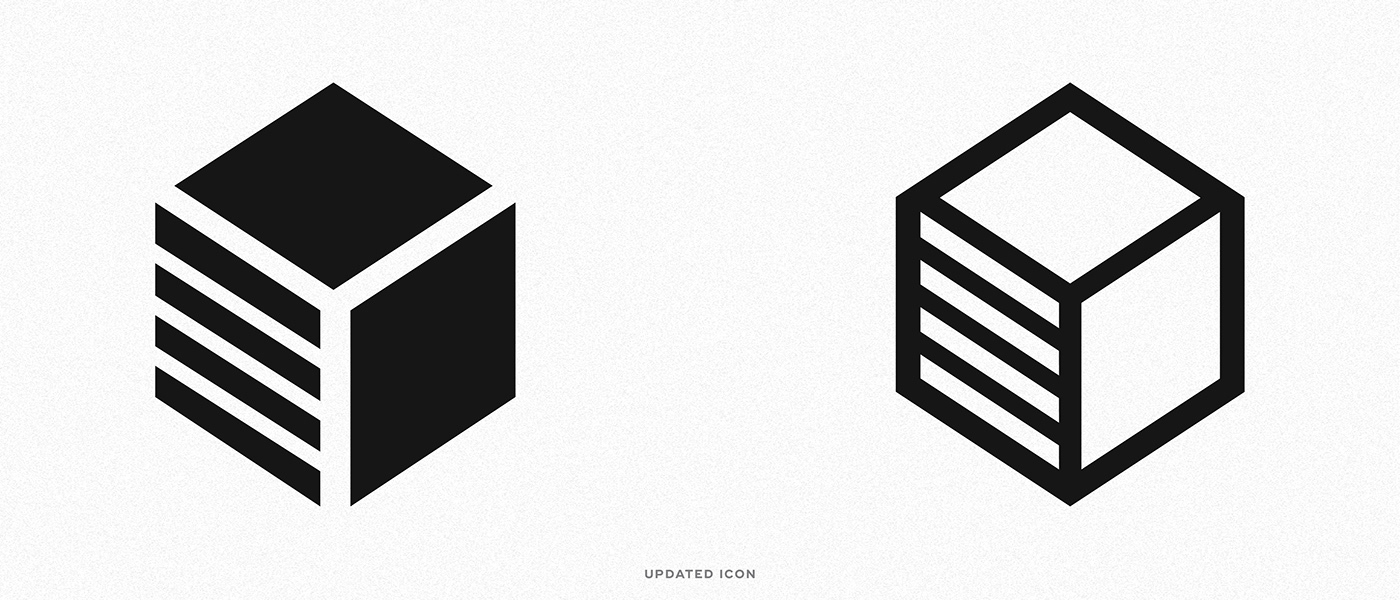
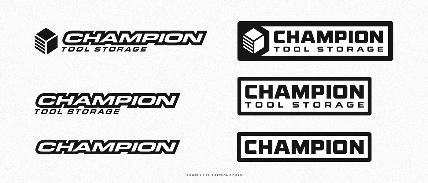
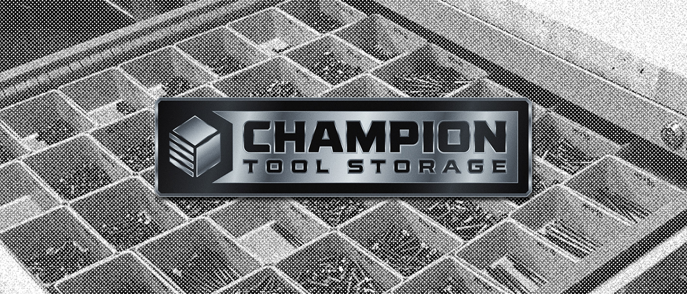
Our goal with this project was to embolden the brands most equitable assets and address its trouble areas. We identified the brand icon (a minimalist, geometric, storage box akin to one of their products) as the brands strongest element, while pinpointing the logotype as something that could be reimagined. The major downside of the brand logotype was that it didn’t fit in with the visual language of the industry; and while we believe in standing out, your brand should still feel relatable within its own market.
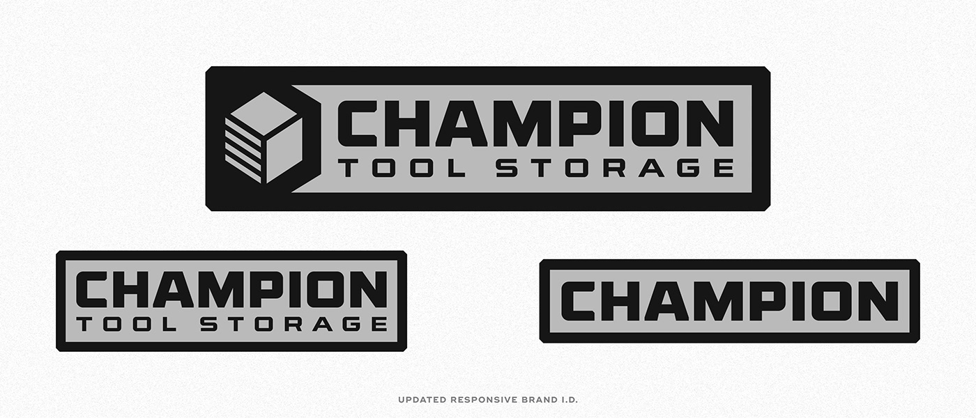
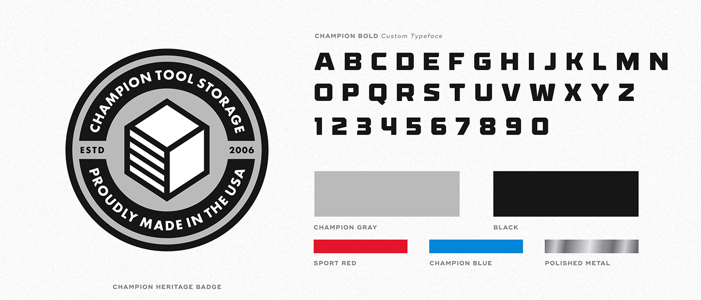
We stripped down the icon and found some structural inaccuracies that we addressed, making it more visually stable. The logotype was given a makeover using custom typography that we then developed into a brand wide typeface called Champion Bold. When paired together the icon and logotype work congruently and don’t feel disjointed as they had prior.
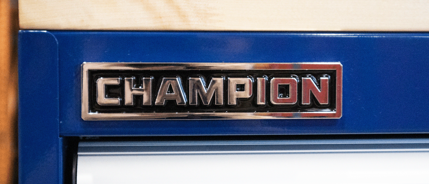
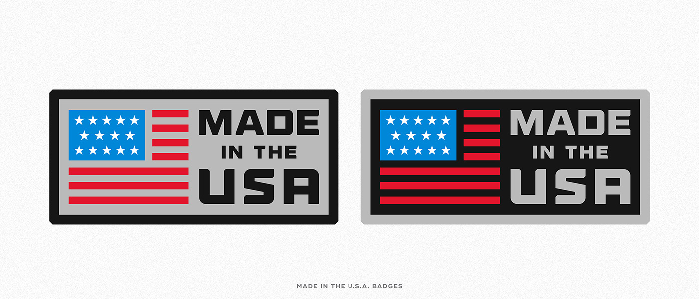
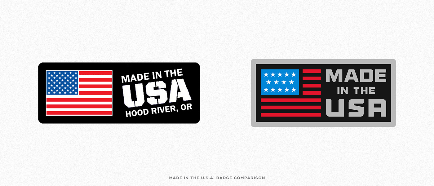
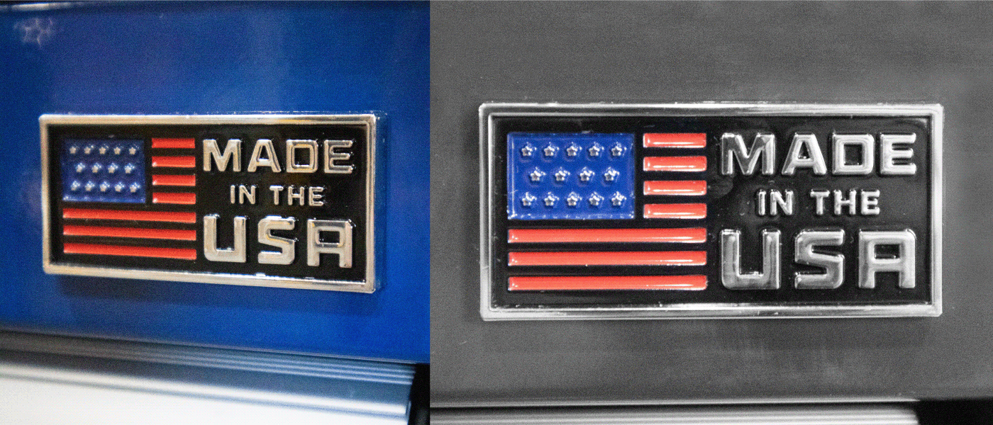
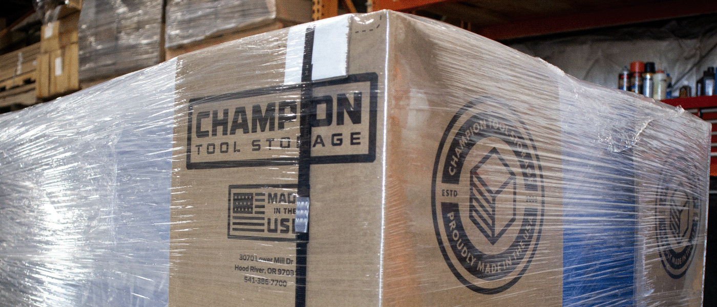
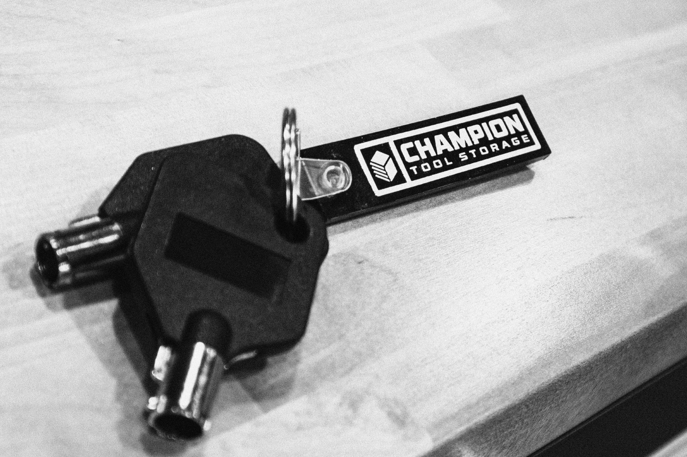
Along with evolving the brand marks, we set out to create a more cohesive system. Along with the marks came updated badges like the companies “MADE IN THE USA” emblem, a new heritage roundel and “CHAMPION BUILT” slogan logo. Wild Giant also created a product line identity based on the updated visual system.
We hope you enjoy our work for Champion Tool Storage.