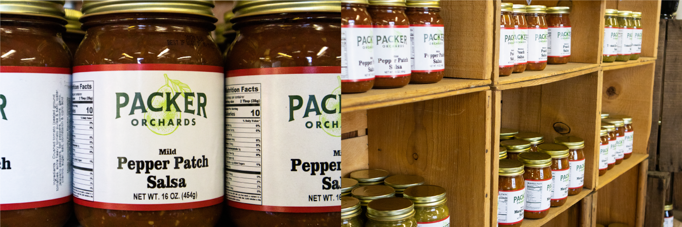
In 2019 the Packer family reached out to us to help them update their 100-year old family business’s branding. Early on in 2020 we spent a day at the orchard discussing a plan and getting to know the business and family. The work took us through a history of not only the family, but of the history of the fruit business in Hood River, Oregon and the Northwest. We dug through countless pages of fruit labels, took pictures of too many fruit crates, and indoctrinated ourselves into what it meant to be a fruit grower then and now.
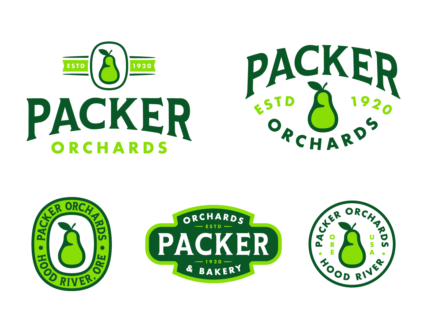
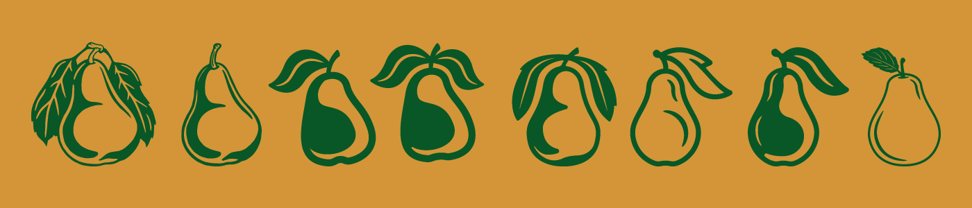
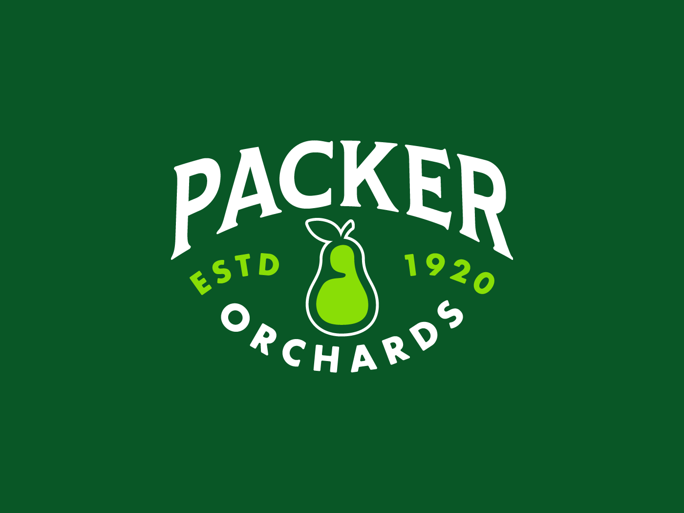
The result was a brand package that blends a classic ephemeral aesthetic with modern design needs. The primary mark is a masthead, a callout to the three major equities of the brand: the family, the heritage and the pear. The Packer’s are famous for their pears and it was always going to be the focal point. We worked up pear after pear, trying to get the right mix of vintage, hand drawn, modern and unique. A tough task, but one that we feel we successfully navigated. The system of badges and crests allows the brand to live in many forms while retaining its notoriety, recognizability and equity.