
BRIEF:
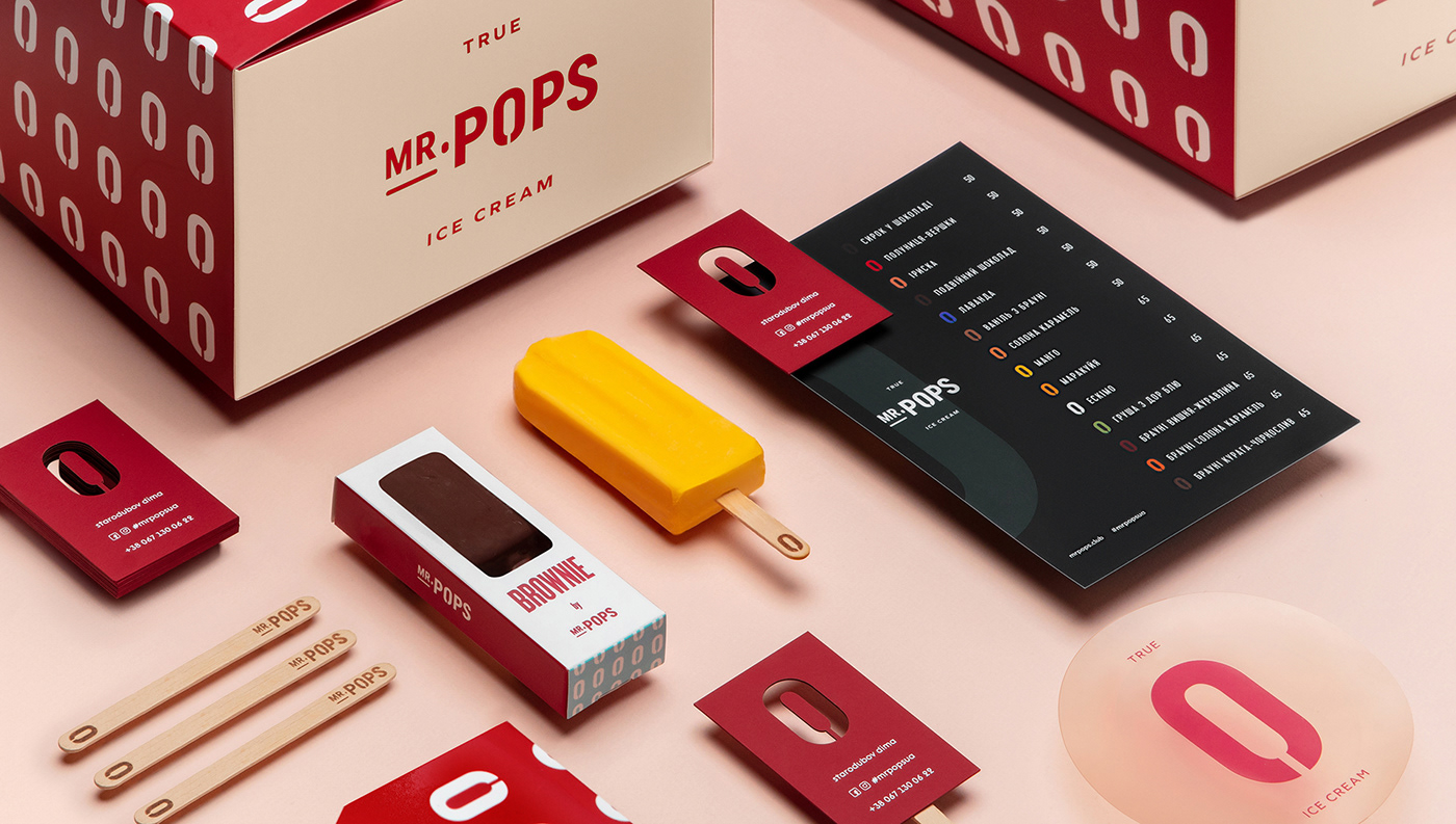
Mr.Pops is the first ice cream brand in Ukraine in the popsicle category.
The client's team approached us to develop a new brand identity.
The main task was to create an identity with reference to the American popsicle aesthetics.
It was necessary to recreate a subtle sense of brand product, if this brand came to Ukraine from the United States, where of course pops culture is born.
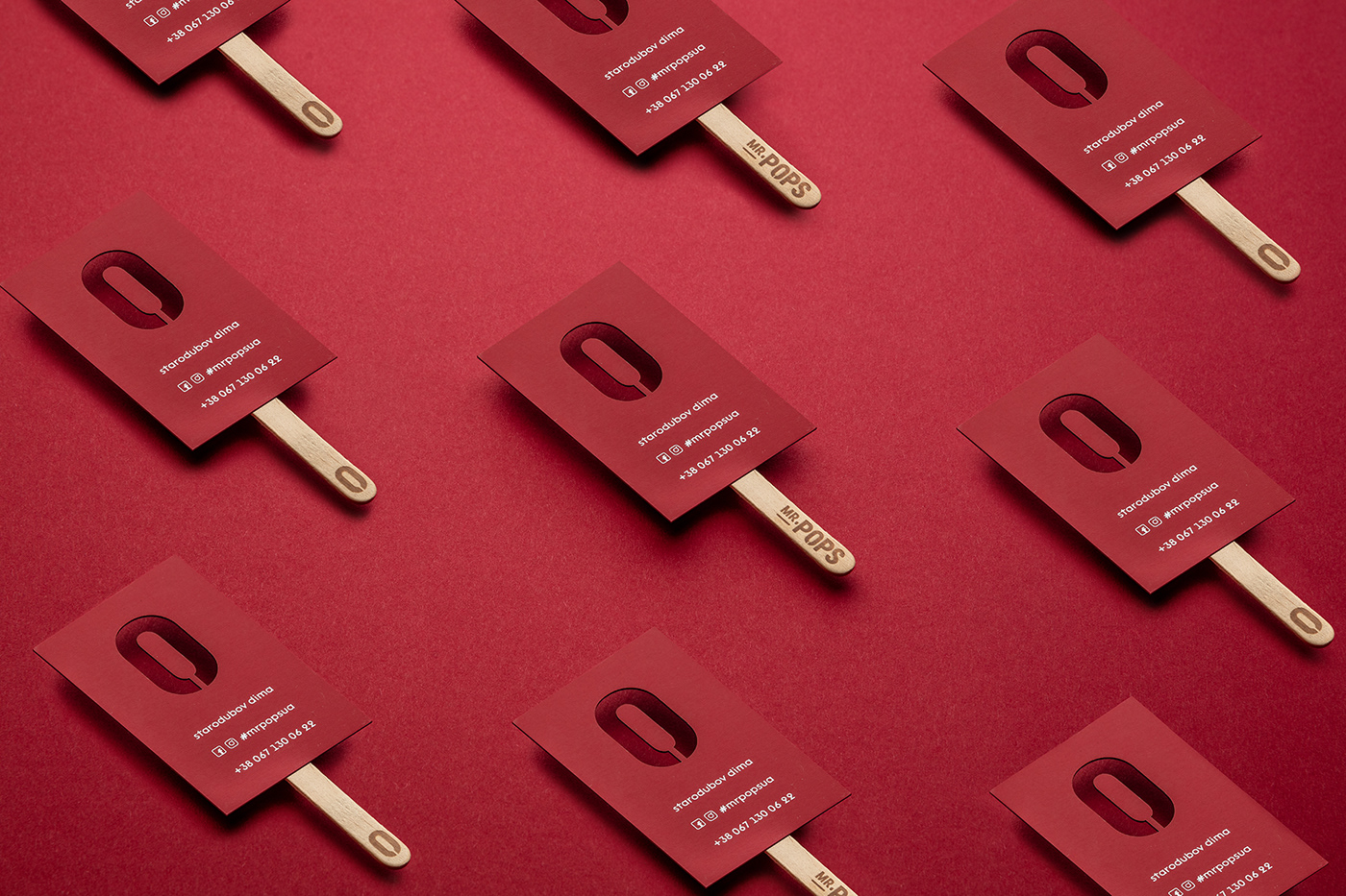
Make a brand that will be easily identifiable in a large stream of visual noise. Also, an important aspect was to find a brand element that can be easily applied even on an ice cream stick :)
IDEA:
First, the brand identity is based on a graphic element of the logo, integrated into the letter "O", which is somewhat reminiscent of the shape of ice cream.
Based on this element, we were able to create a simple graphics system, pattern, and adapt this technique to all carriers of style.
Secondly, we found a very good font, customizing it a bit for our needs. We spent a lot of time looking for a color combination, which in our opinion, very well emphasizes the graphic message and creates a sense of brand.
And we were still able to solve the problem of applying the brand element of identity on an ice cream stick :)
This project is a winner of RED DOT DESIGN AWARDS 2021.


Team:
Alexander Sydorenko - Art-Direction / design
Andriy Selimov - Graphic Design
Photo production - Lustre Studio


